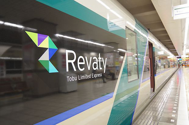
TOBU 500 Revaty
東武 500 Revaty
- 東武鉄道 / TOBU RAILWAY
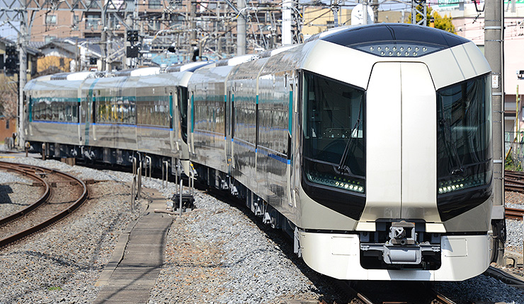
東武鉄道の特急車両「500系」のデザインを担当しました。
外観は東京スカイツリーに代表される先進的でシンボリックなデザインとし、車体基本色の「シャンパンベージュ」でおおらかで豊かな時の流れを、特急の格式と沿線の緑豊かな自然を「フォレストグリーン」で表現し、東武グループのグループロゴカラーである「フューチャーブルー」を窓下にあしらい、全体デザインを引き締めています。
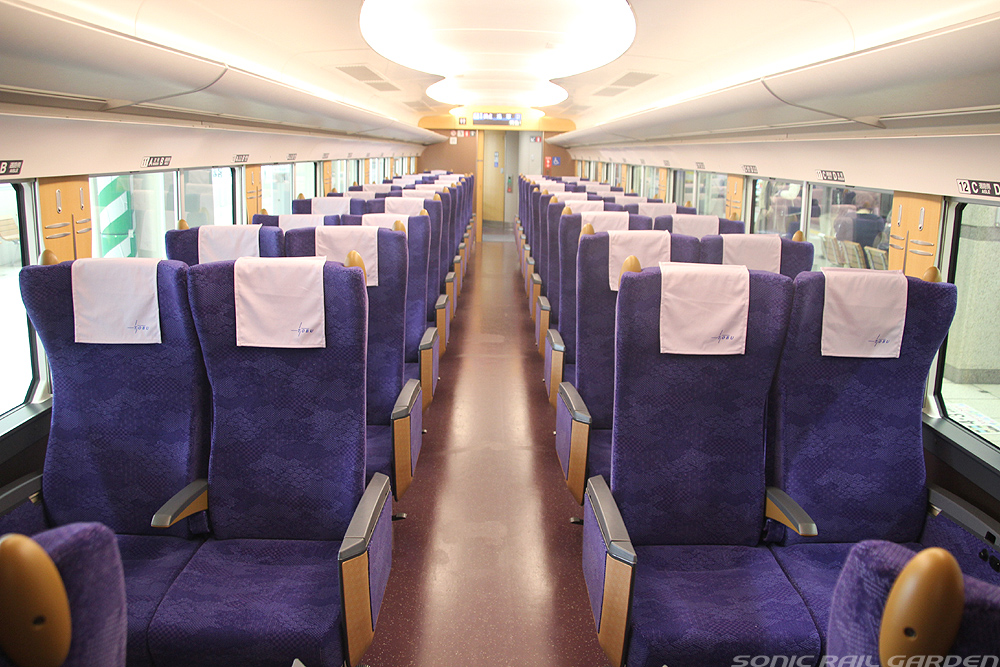
内装は江戸の伝統色「江戸紫」をモチーフとした色の腰掛けや、天井には鬼怒川や隅田川の流れをイメージした造形をあしらうなど、“沿線の魅力をつむぐ”デザインとしています。
Tobu Railway new Express train Type 500 was designed by KEN OKUYAMA DESIGN.
Innovative and symbolic design of the TOKYO SKYTREE is taken in account for its Exterior design. The “champagne beige” as its basic body color, expressing our affluent life, and the “forest green” color as abundant nature along the railways. The Tobu group’s “future blue” color is at the bottom of the windows.
For the interior, we used a traditional purple from Edo period “Edo Murasaki” on the seat, and the design of the ceiling is inspired from the image of Kinu river and Sumida river.
《The picture of exterior is provided by Kawasaki Heavy Industries,Ltd. / Interior: Tobu Railyway Co., Ltd. 》