E6 Akita Shinkansen
E6秋田新幹線像
- JR東日本(東日本旅客鉄道)/JR East(East Japan Railway)
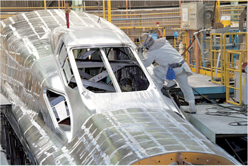
JR東日本の秋田新幹線E6系の内外装デザインの監修を行いました。
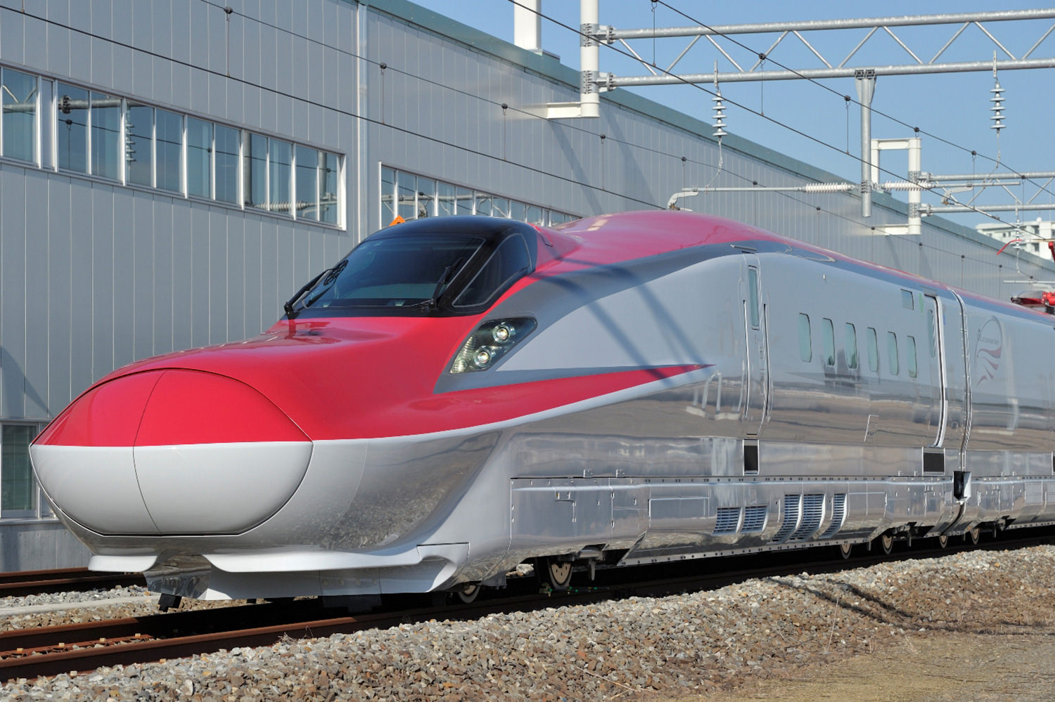
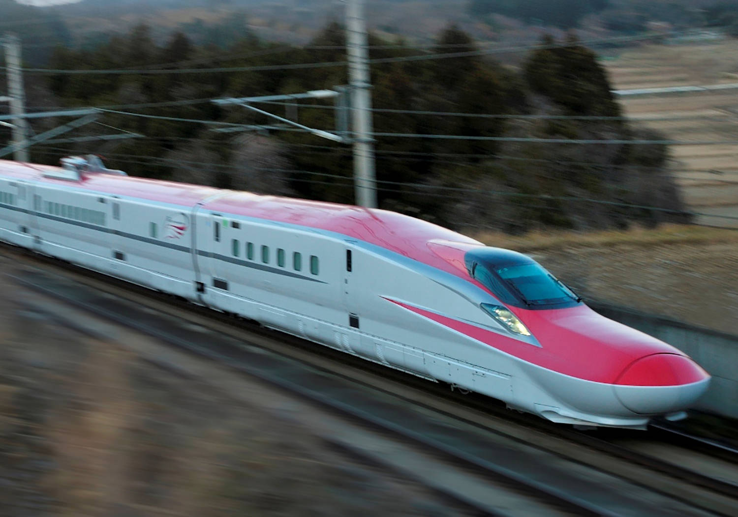
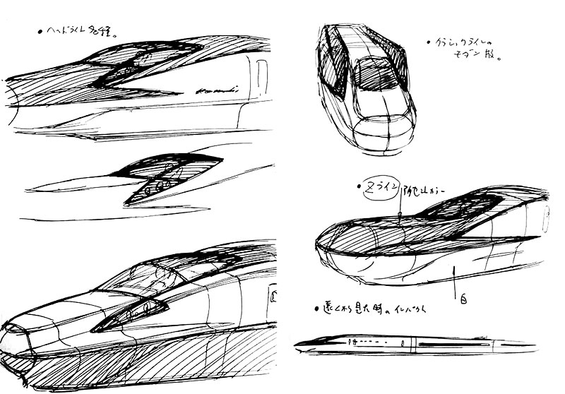
外装は13メートルのロングノーズタイプの先頭形状で、「飛雲(ひうん)ホワイト」と名付けられたメインボディカラーと車体上部には、なまはげをイメージした「茜色」を採用しています。
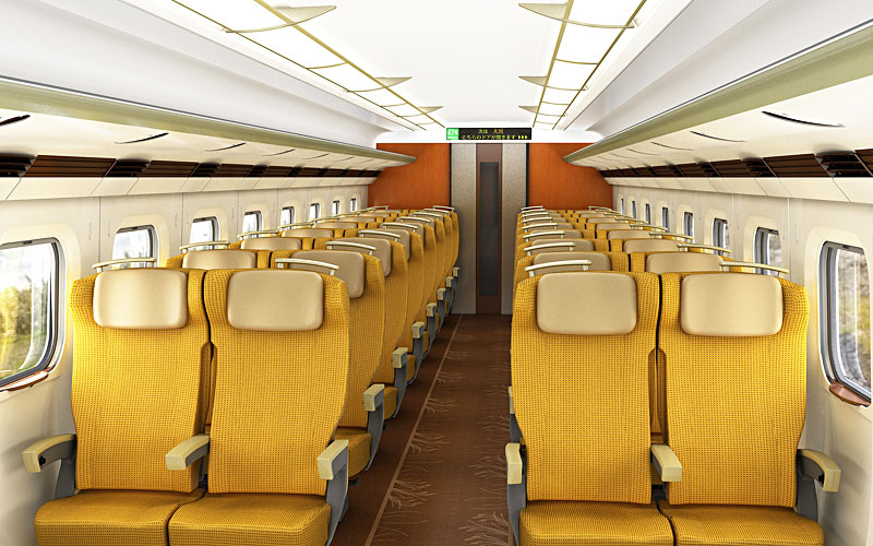
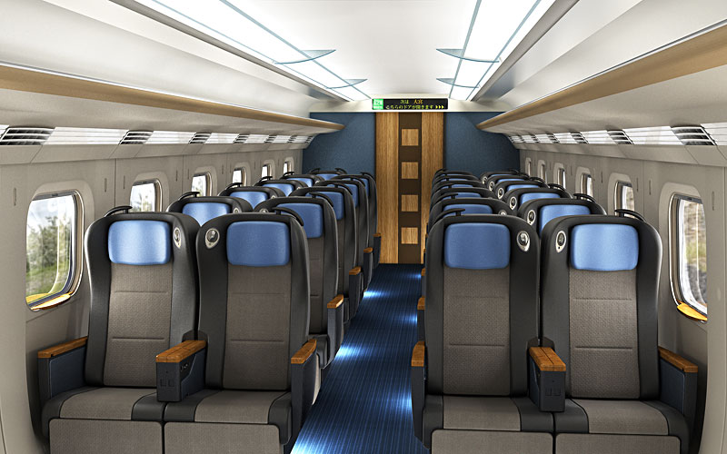
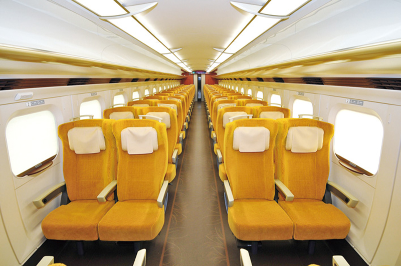
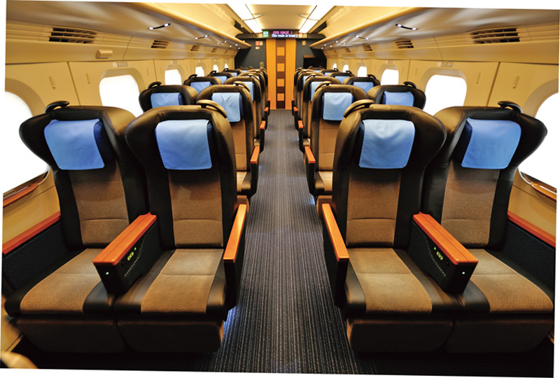
内装は、「ゆとり」「やさしさ」「あなたの」をキーワードに「丁寧な拵こしらえと誂あつらえ」をコンセプトとしてデザイン。グリーン車は、秋田の伝統工芸、楢岡焼の釉薬の青色と川連漆器の茶色をイメージ。普通車は、豊かに実った稲穂の中へ分け入る時の高揚感や自然の恵みを感じられる空間となっています。
The new vehicle system “E6” of the East JR Akita Shinkansen, KEN OKUYAMA DESIGN supervised interior and exterior design.
System “E6” is a 13m long-nose type. Under the concept of “White Flying Cloud”, we used the madder red color – inspired by “namahage”, a traditional Japanese folklore – on the main top part of the body.
With “Affluence”, “Genteelness” and “Personal” as keywords, we designed the interior under the concept of “Hospitality and Customization”. In the green cars, we used the colors of traditional crafts in the Akita prefecture, such as Naraoka Wares’ blue glaze and Kawaren Lacquer Wares’ brown. In the ordinary cars, we created a space in which you can feel elation and nature’s bounty when passing through rice fields.